Cursive C: How to Write Uppercase & Lowercase (with PDF Worksheets)
Cursive c is a curved letter in the cursive alphabet that follows a smooth flow and connects easily with others in handwriting. Learning how to write it properly helps children and beginners improve their writing rhythm, speed, and overall pen control.
This guide focuses entirely on how to write the cursive letter c both lowercase and uppercase. You’ll find step-by-step instructions, printable worksheets, and simple tips to make practice easier and more effective.
Let’s begin with a free worksheet to get your hand moving the right way.
Download Free Printable Cursive c Worksheet
To begin writing cursive c, download this free printable worksheet designed for beginners. It includes guided arrows, starting points, and extra lines for practice.
This sheet helps students get used to the flow and spacing of the cursive letter c. It works well for classroom use, homeschooling, or extra handwriting support at home.
How to Write the Cursive Letter c?
The letter c in cursive is small, curved, and smooth. It’s one of the easiest letters to start with because it doesn’t need any sharp turns or complex loops. It feels like drawing a soft hook, and once you get the rhythm, it becomes second nature.
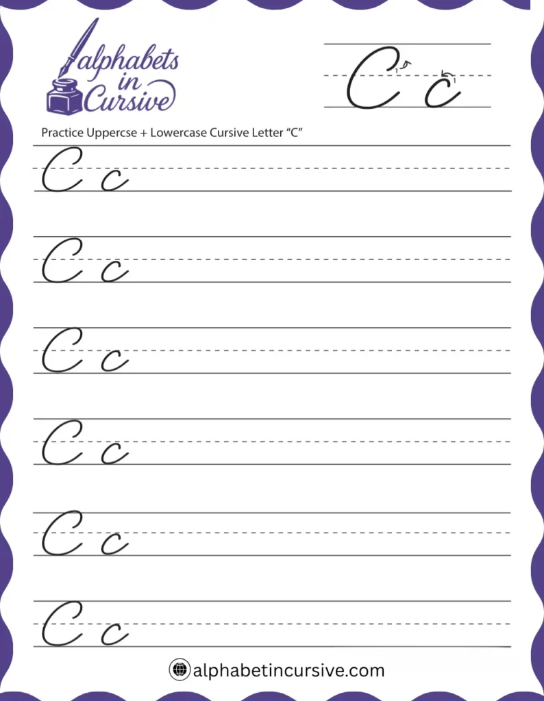
To write it correctly, you’ll need to learn both lowercase and uppercase versions. Each has its own shape but starts with a similar curve.
Let’s start with lowercase first.
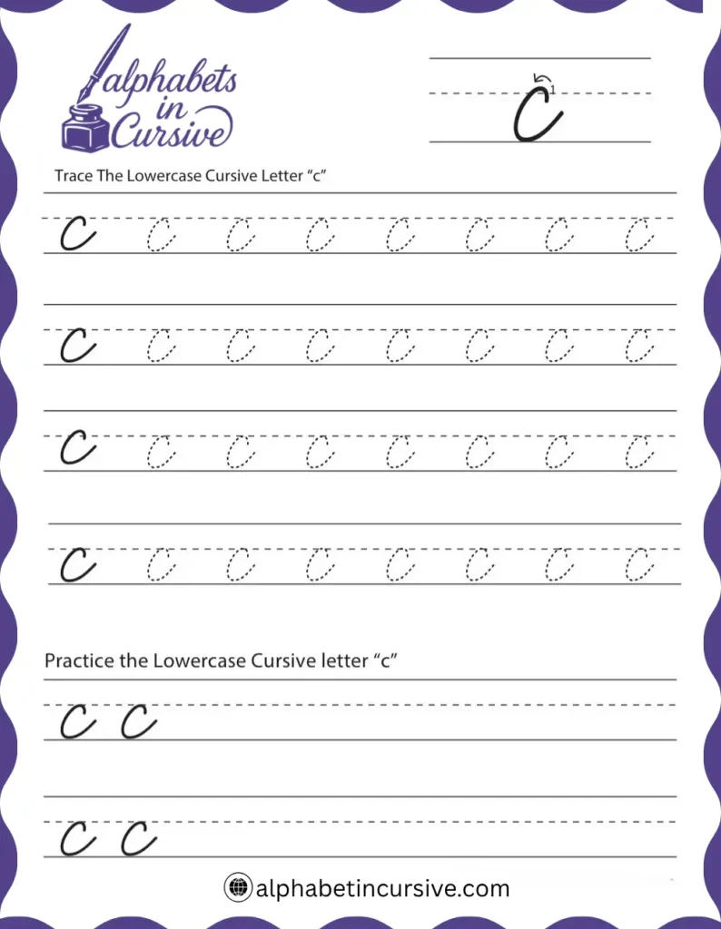
How to Write Lowercase Cursive c?
This version is short and round. It flows from left to right without lifting the pencil. Most beginners find it simple because it follows a natural curve.
Steps to follow:
- Start at the bottom line.
- Move up slightly in a rightward curve.
- Swing left to make an open curve, like a small “o” that doesn’t close.
- Curve back down to the bottom line.
- Finish with a light tail that moves out to the right to join the next letter.
Visual cue (described in words):
It looks like a small, open mouth or half circle. Picture drawing the start of a lowercase “a,” but stop before you close the loop. The tail should sit neatly along the base line, ready to connect.
Common mistakes (lowercase) C.
When writing the cursive letter c, many people make small mistakes that change how it looks. Here are some common ones to watch out for:
- Not joining properly: The curve doesn’t connect smoothly to the next letter.
- Too sharp or flat curve: The shape should be round, not pointed or straight.
- Starting too high or low: Begin on the right line so your letter looks neat.
- Uneven size: Keep the cursive c the same height as other small letters like a and e.
Practice slowly and make sure your c looks soft and smooth.
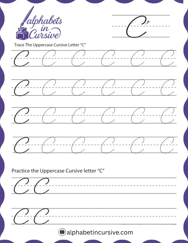
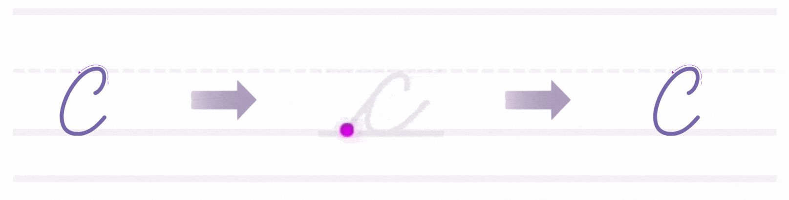
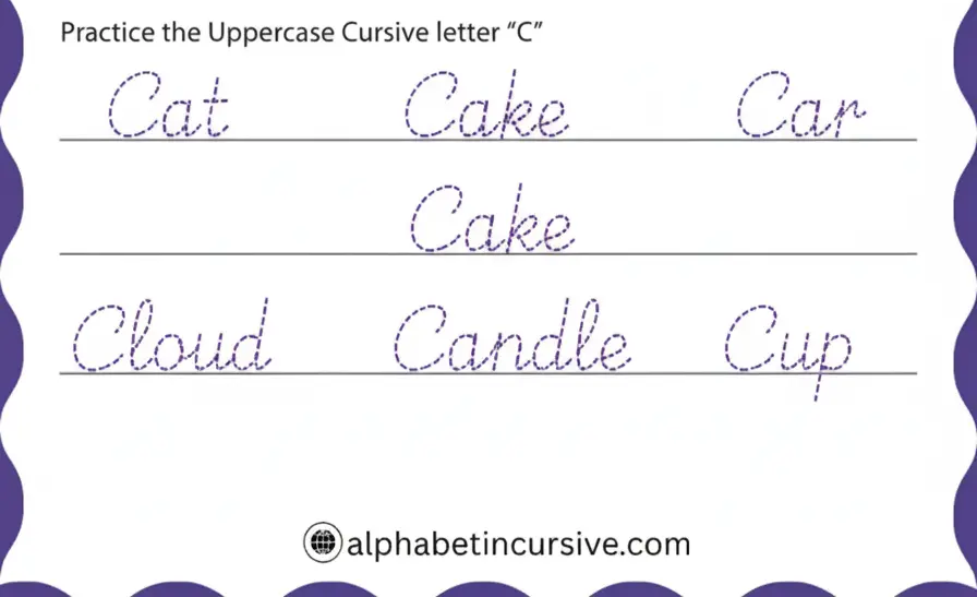
How to Write Uppercase Cursive C
The capital C is much larger and loops higher. It’s made in one stroke, but needs good control to keep it rounded and balanced.
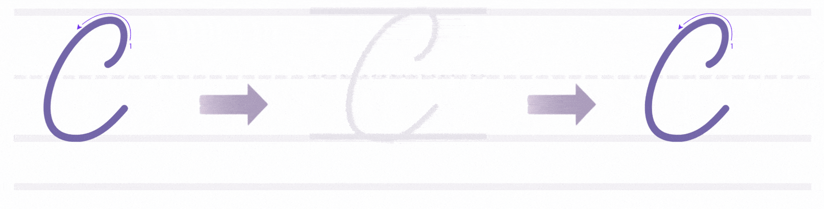
Steps to follow:
- Begin just below the top line.
- Curve up slightly, then swing left in a wide arc.
- Loop down and around to the left, forming a large open shape.
- Let the stroke curve gently upward as it ends just above the bottom line.
Visual cue (described in words):
Think of drawing a wide “3” but without sharp corners. It’s round, open, and flows from top to bottom in a backward curve.
Take your time on the uppercase letter it needs more space and a steady curve. Once it feels smooth, it becomes easy to repeat.\
Common mistakes (uppercase) C.
When writing the uppercase C in cursive, some people make small mistakes that change how it looks. Here are a few common ones:
- Starting too high or too low – The letter should begin on the top line and curve smoothly.
- Making it too round or too flat – The C should have a gentle curve, not too tight or too wide.
- Not closing the curve properly – Some people stop too soon, making the letter look like an open circle.
- Adding extra loops or lines – Keep it simple; cursive C doesn’t have extra decorations.
Practice slowly and watch how your hand moves to make a clean, smooth C every time.
How to Connect Cursive c to Other Letters
Cursive “c” is one of the easiest letters to connect! It ends with a small upstroke, which smoothly leads into the next letter.
How to Connect Lowercase Cursive c
Lowercase c is one of the easiest letters to connect in cursive. It finishes with an open tail that leans right, making a clean path into most small letters. You don’t need to lift your pencil or shift your hand it’s built for smooth transitions.
What to keep in mind:
The ending stroke of c should stay close to the baseline. If it swings too high or too flat, the connection can feel awkward. It helps to keep your wrist relaxed and let the pen follow through naturally. That tail should flow right into the next shape not too fast, not too wide.
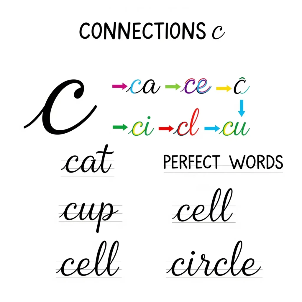
Common letter pairs:
- ca – After finishing c, the stroke rises slightly into a small loop. It should feel like drawing one wide curve into another.
- ce – The curve of the e picks up right at the tip of c’s tail. Keep your hand moving to avoid a break between letters.
- ci – This pair is quick. The tail of c glides up just enough to drop into the short stroke of i. Watch the spacing so your i-dot doesn’t float too far.
- cl – Here, c leads into a tall vertical line. Don’t stop between them the trick is to let the curve roll up into the l without hesitation.
- cu – These letters share the same slant. c bends right into u like waves running together.
Practice with short words like cat, cup, cell, and circle. Focus on how your hand moves, not just how it looks. If your curves feel stiff or disconnected, slow down. You’re not aiming for speed just steady, connected letters.
How to Connect Uppercase Cursive C
Uppercase C is a different story. It’s wide and open, and most cursive styles treat it as a stand-alone letter. You’ll usually see it at the start of a name or title, and in most cases, writers lift their pencil after finishing it.
What to keep in mind:
If you do connect, the ending stroke of C must curve inward and down with a gentle finish. It should meet the next letter near the midline, not too low. But unless your style really calls for it, it’s fine to keep uppercase C separate from the next letter.
Example words and names:
- Cameron – Write C fully, then begin the a slightly beside it.
- Claire – You can glide from the C into l, but only if your stroke is steady.
- Colin – The C ends, and the o starts fresh. That small space between letters still looks natural.
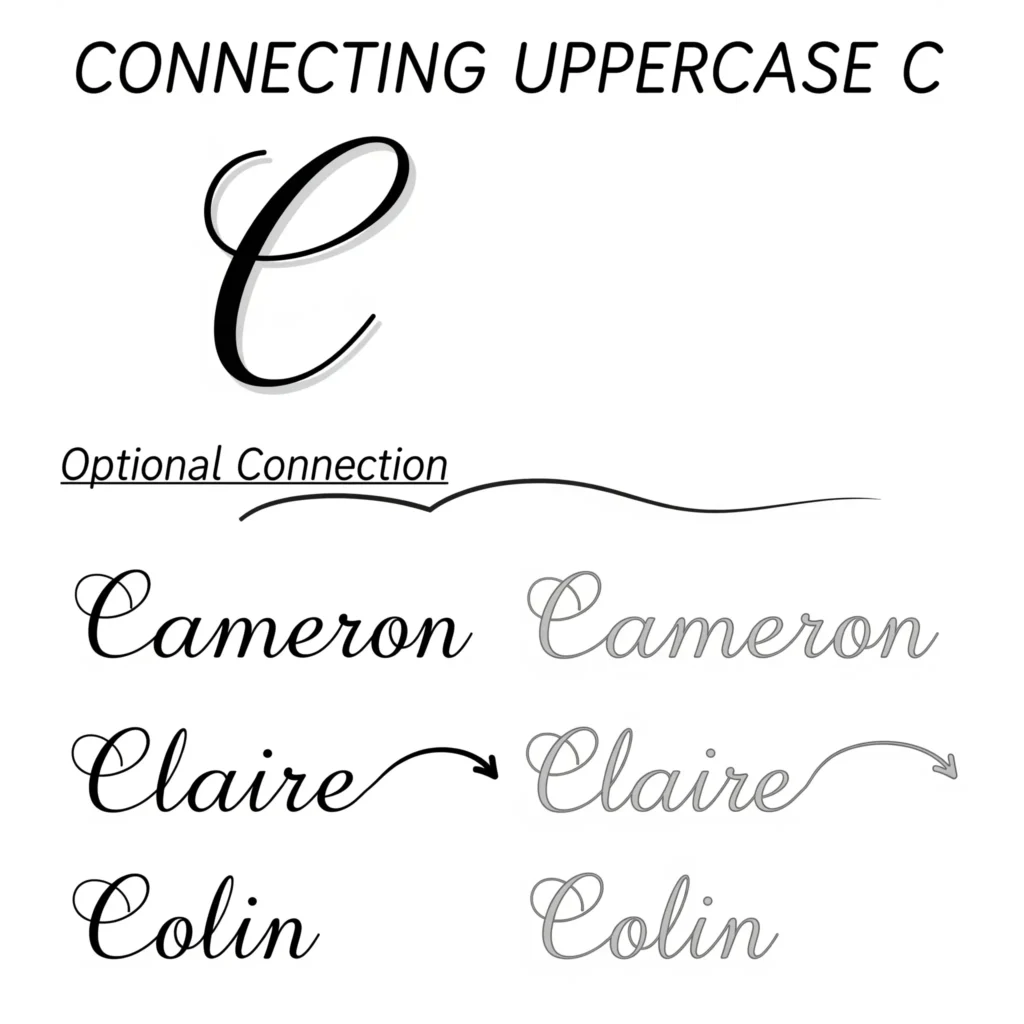
Practice tip:
Try writing the same word with and without connecting the C. Choose whichever version feels smoother and more legible. Teachers often accept both, especially in casual or personal handwriting.
Practice Methods for Writing Cursive c
Practice isn’t just about filling a page with loops. It’s about control, consistency, and feel. The cursive alphabet c may look simple, but without good form, it quickly becomes uneven or sloppy. That’s why the right kind of practice matters.
Practice Words with “c”
This sheet helps you practice writing cursive words that include the letter “c.” Each word is chosen to help you improve your hand movement and letter connection. Follow the examples, trace slowly, and then try writing on your own.
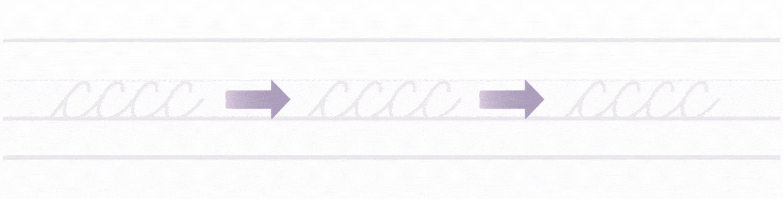
1- Start with Single Letters
Begin with lines of just lowercase c. Use ruled paper with a midline to help with size control. Each c should stay below the midline, round and open, ending with a light rightward tail.
Slow down and aim for consistency, not speed. Keep the curve soft, and make sure the tail doesn’t stretch too far.
Tip: If your letters slant differently, adjust how you’re holding the pencil and how your arm moves not just your fingers.
2- Move to Letter Pairs
Once your single letters look balanced, begin connecting them to common letters. Try:
- ca, ce, ci, cl, co, cu
These pairings help build rhythm and control. They also train your hand to move smoothly from one letter to the next without lifting the pencil.
3- Use Tracing and Air Writing
For beginners, tracing over dotted c shapes helps build muscle memory. You can also use your finger to trace large c letters in the air or on a table. This builds confidence before using a pencil.
4- Set a Short Daily Routine
Practice five minutes a day. Stick to a small goal: one page of c, a few word combinations, or one line of a sentence. Keep the focus on shape and control not speed.
Sentences That Use Cursive c
Practicing full sentences helps you apply what you’ve learned in real writing. The goal isn’t speed it’s control, spacing, and keeping your letters connected.
Start with Short, Simple Sentences
Use sentences that repeat the cursive letter c in different positions. Keep them short enough to focus on each stroke without feeling rushed.
Examples:
- Cats can curl close to couches.
- Claire called Cody in class.
- Colin cut colored cards.
- Cold cocoa calms Carla.
These sentences include c at the beginning, middle, and end of words. This helps you practice different types of connections and letter spacing.
What to Focus On
- Letter joins: Make sure your c connects smoothly to the next letter.
- Baseline control: All letters should sit on the same line without bouncing.
- Even size: Keep lowercase c about half the height of uppercase letters.
- No dragging: Tails of c should be short and clean, not long or stretched.
One Comment