Cursive Alphabet: Letter M Worksheet and Practice Methods
The cursive letter M is made with smooth, rounded strokes that move in waves across the line. It’s one of the most common letters in names and words, and it plays a key role in learning how to link several bumps in one motion. Mastering cursive M helps develop rhythm, even spacing, and full-word flow.
This guide will walk you through how to write cursive M, how to connect it to other letters, and how to use cursive worksheets and practice methods that actually help.
Let’s start with the worksheet designed to help you get it right from the beginning.
Download Free Printable Cursive M Worksheet?
The best way to learn cursive M is by using a worksheet that shows the full letter shape, step order, and space to repeat it correctly. This printable cursive M worksheet is designed to make writing easier and cleaner especially for beginners and school use.
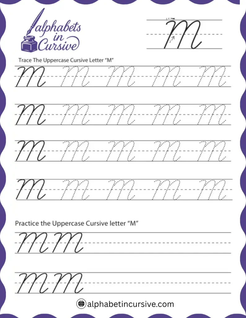
How to Write the Cursive Letter M
The cursive letter M moves in waves. It’s one of the few letters that use multiple humps in one stroke. If you’re just learning, the lowercase cursive m teaches you control and rhythm. The uppercase M is bigger and more detailed, with sharp turns and careful height.
Let’s break down both.
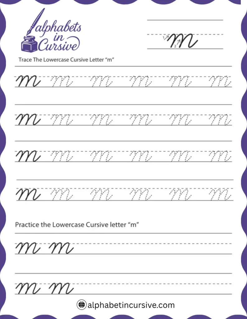
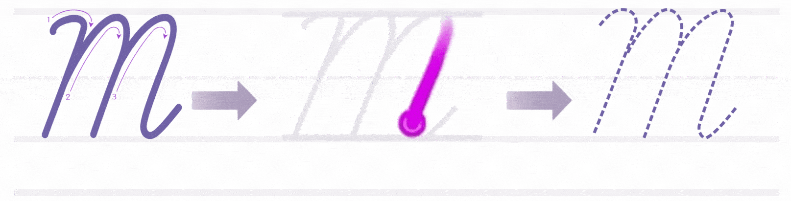
How to Write Lowercase Cursive M
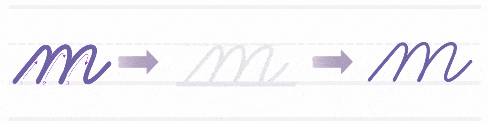
Lowercase cursive m uses three connected arches, all written without lifting your pencil. It’s easy to confuse with n, so keeping even curves is key.
Here’s how to write it:
- Start on the baseline
- Curve up to the midline
- Drop straight down, then curve back up — that’s your first bump
- Repeat the same stroke two more times
- After the third bump, exit with a short rightward stroke to connect to the next letter
What to pay attention to:
- All three bumps should be the same height
- Make sure each arch touches the midline
- Keep a steady motion — don’t rush or pause between bumps
- Avoid pointy turns or sharp angles
How to Write Uppercase Cursive M
Uppercase cursive M is built from tall, clean lines with strong turns. It usually begins names like Mary, Mila, or Mark. It should look bold but still smooth enough to write without strain.
Step-by-step instructions:
- Start just above the baseline
- Swing up to the top line with a wide curve
- Come straight down to the baseline
- Make a sharp turn right and go back up again — not as tall this time
- Curve slightly left, then dip back down to the baseline again
- End with a short right-facing exit stroke to begin the next letter (if needed)
Extra practice:
Write the word “Mom” five times, focus on making the first M and the second m balance each other in size and flow.
How to Connect Cursive M to Other Letters
Lowercase cursive m connects smoothly from its final hump. It ends on the baseline with a small curve that points right, making it easy to join with most letters. Uppercase M is more flexible — it often stands alone but can connect when needed.
How to Connect Lowercase Cursive M
Lowercase m ends with a soft exit stroke. Since it’s written with three full bumps, the last curve should land cleanly on the baseline, ready to move into the next letter.
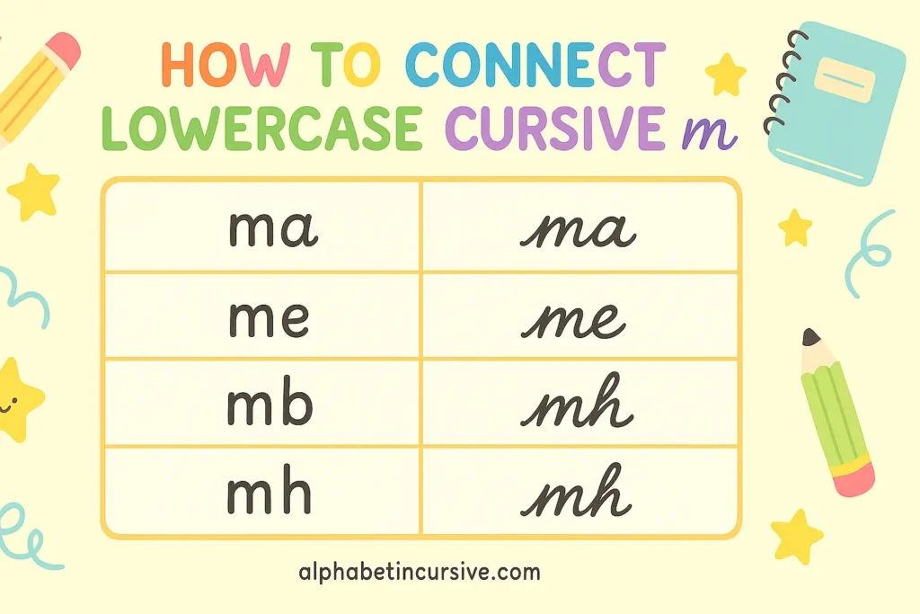
Connecting “m” to Different Letter Types
- To vowels (a, e, o): Use a light curve that flows up into the next letter
Example: ma, me, mo — keep the spacing tight - To tall letters (l, t, h): After m, swing gently upward to begin the tall stroke
Example: ml, mt — avoid flattening the hump before the tall letter - To loops (b, f, k): End the m cleanly, then start the loop tall and thin
Example: mb, mf — pause slightly if needed
Common Letter Pairs for Practice
Try these pairs to improve rhythm and spacing:
- ma, me, mi, mo, mu
- ml, mt, mh
- mb, mk, mf
- am, im, om, em
Write each pair across a row. Keep your hand steady and watch that each letter starts right where the m ends.
How to Connect Uppercase Cursive M
Uppercase cursive M is wide and strong. It usually appears at the beginning of a name or title. Most of the time, people lift the pencil after finishing it, but it can be connected with a soft ending stroke.
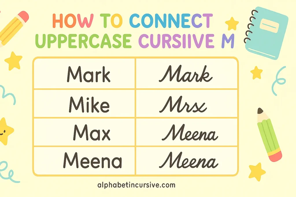
Connecting “M” to Other Letters
- To small letters (like a or e): If your M ends near the midline, curve down into the next letter
Example: Max, Meena — the e or a can follow closely - To tall letters (like T or L): These are rarely connected to M. Most people lift after M, then write the next letter
Example: Mark, Mike — write M fully, then start the next letter clean
Tip: For neatness, lifting after an uppercase M is always okay. School styles often allow both forms.
Practice Methods for Writing Cursive M
Cursive M looks simple, but writing it neatly takes rhythm and control. Lowercase m has three rounded bumps that must stay even. Uppercase M uses more space and stronger turns. These methods are built to help students train their hand, keep size steady, and avoid common mistakes.
- Start by tracing over large examples of lowercase and uppercase M
- Use arrows and stroke numbers to learn direction and flow
- Switch to dotted-line M without guides
- Practice lowercase m with all three bumps the same size
- Move to blank ruled lines without guides
- Repeat tricky combinations three times per row
- Practice just the middle part: curve up, bump, curve down
- Fill rows with the m bumps: uuu uuu uuu
- This helps with rhythm and even spacing between arches
Frequently Asked Questions
How do I form a lowercase cursive m?
Start on the baseline, rise to the midline, and make three rounded humps. Each bump should be the same height. Finish with a small curve that flows into the next letter.
What’s the difference between cursive m and n?
The letter m has three humps, while n has two. Keep the spacing even so each bump is clear and not crowded. Practice both side by side to tell them apart easily.
What are common mistakes to avoid for cursive m?
Making the bumps too sharp or pointy
Uneven hump size
Rushing and creating messy spacing
Confusing m with n due to tight writing
Stretching the strokes too wide or too flat