Cursive Alphabet: Letter R Worksheet and Practice Methods
The cursive letter R has a sharp upward stroke and a short hook, making it look different from the printed version. It’s one of those letters that feels quick but needs control to look clean. The uppercase form is tall and curved, while the lowercase one is smaller with a unique lift in the middle.
This article walks you through how to write both forms of R, how to connect them to other letters, and how to build neat, confident strokes with daily practice. A printable worksheet is included to help you get started right away.
Let’s begin with the worksheet.
Download Free Printable Cursive R Worksheet
You can get a printable worksheet that focuses on writing the cursive letter R. It includes guided tracing for both uppercase and lowercase forms, dotted letters to practice with more control, and blank lines for writing freely.
How to Write the Cursive Letter R
Cursive R has its own rhythm. The lowercase form is quick and simple, while the uppercase one has a loop and diagonal tail that makes it stand out. With steady strokes, both can be mastered easily.
How to Write Lowercase Cursive R
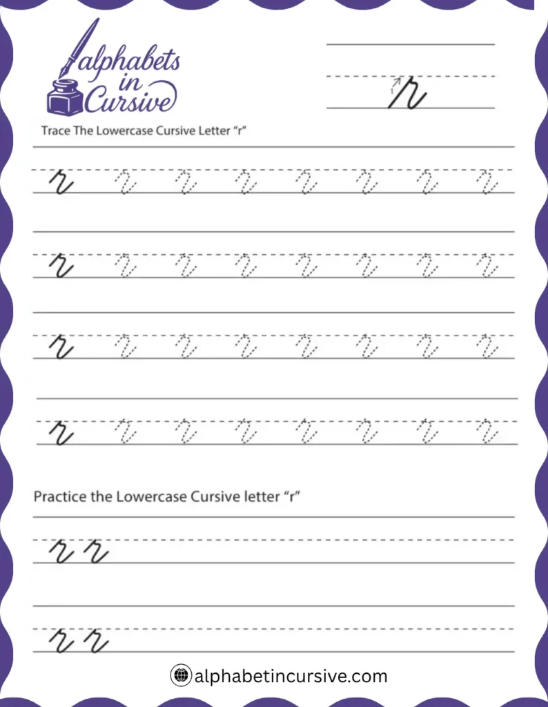
Lowercase r is one of the shortest cursive letters. It stays between the baseline and midline, with no loops or long tails.
This shape is tight and simple. It doesn’t go above the midline or below the baseline, and the final stroke gently leans forward, ready to join the next letter.
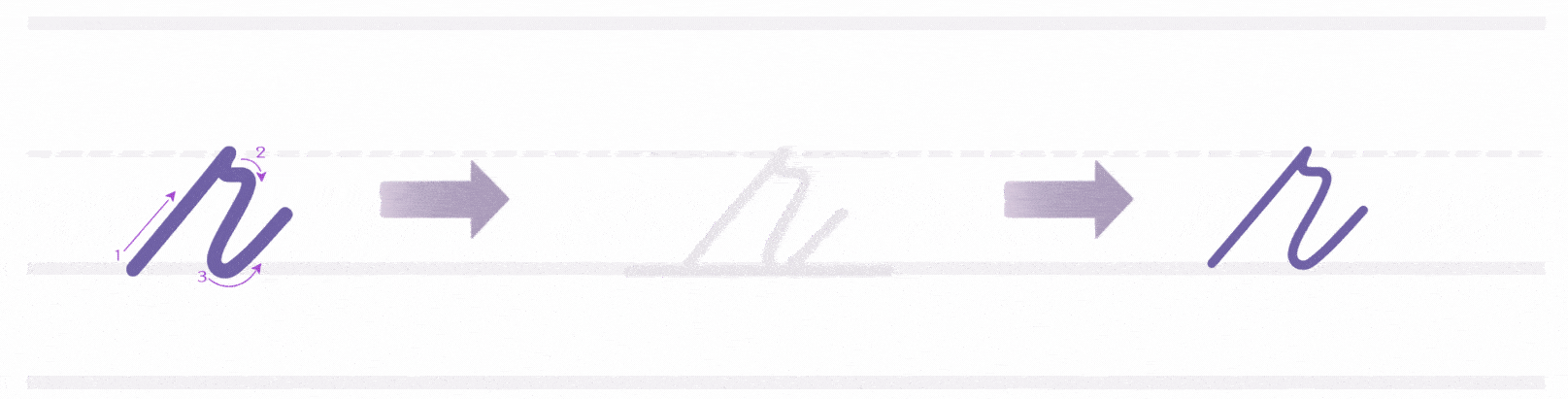
- Begin at the baseline
- Make a straight upward stroke to the midline
- Curve slightly right, then pull the stroke back down to the midline
- Create a small arch that stays within the midline space
- Finish with a soft upward curve just above the midline to connect to the next letter
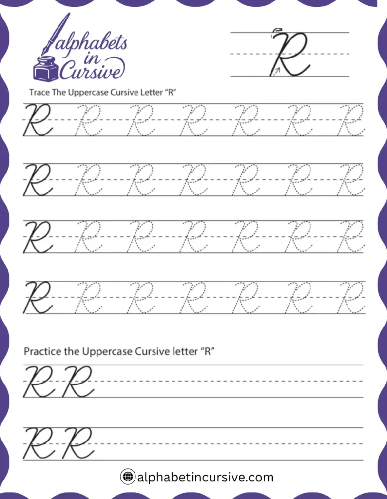
How to Write Uppercase Cursive R
Uppercase R is more detailed. It has a loop at the top and a diagonal leg that makes it look strong and formal.
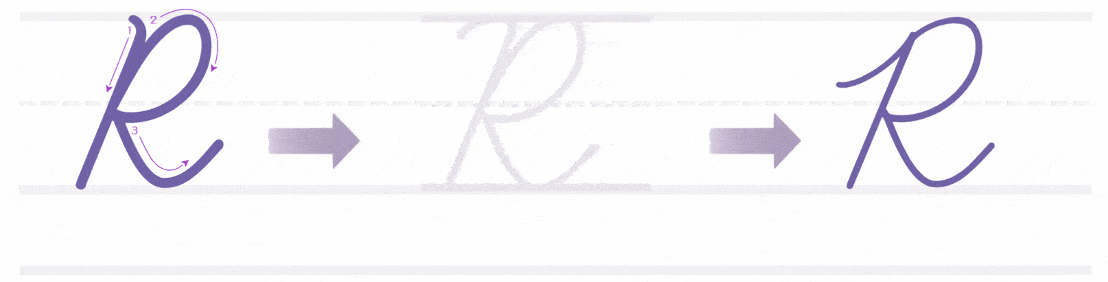
- Start at the top line of the paper
- Curve up slightly, then pull a slanted stroke straight down to the baseline
- Without lifting, curve back up and to the right, forming a loop that touches the midline
- Loop back left, creating a shape like the top of a cursive P
- From just below the midline, add a diagonal stroke that crosses back to the right
- Optionally, end with a short upward curve if connecting to another letter
This letter is tall and curved, with one diagonal leg that adds balance. It works best when drawn in a single, fluid motion.
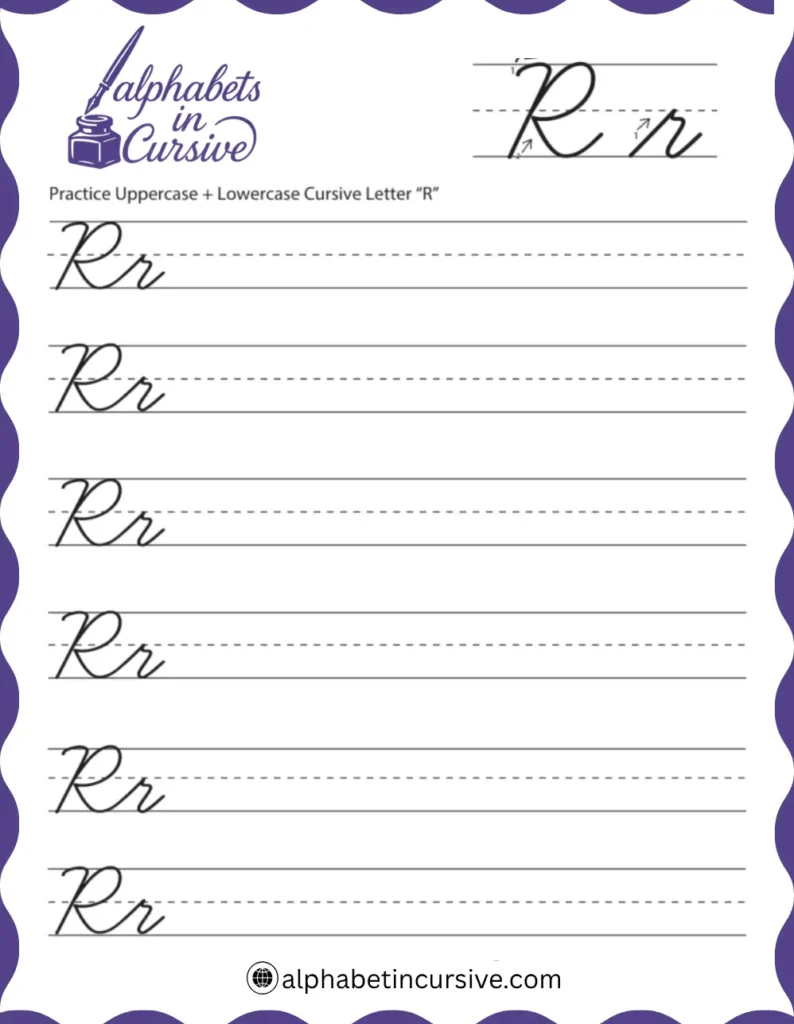
How to Connect Cursive R to Other Letters
Start by completing the “r” with a slight upward curve that extends just above the middle line.
How to Connect Lowercase Cursive R
Lowercase r ends with a small upward stroke that naturally leads into the next letter. Because it doesn’t loop or dip below the line, it connects easily with most lowercase letters.
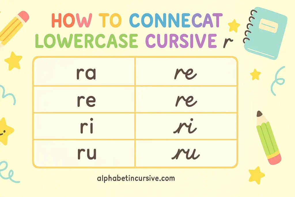
How it connects:
- After finishing the short arch, continue with a gentle upward stroke
- The exit line moves slightly above the midline to meet curved letters like a, e, o
- For tall letters like l or t, the connection should rise more steeply
- You don’t need to lift your pencil between letters — the flow stays smooth
Practice pairs: ra, re, ri, ro, ru
How to Connect Uppercase Cursive R
Uppercase R usually appears at the start of words, especially in names. Depending on your style, you may or may not connect it to the next letter.
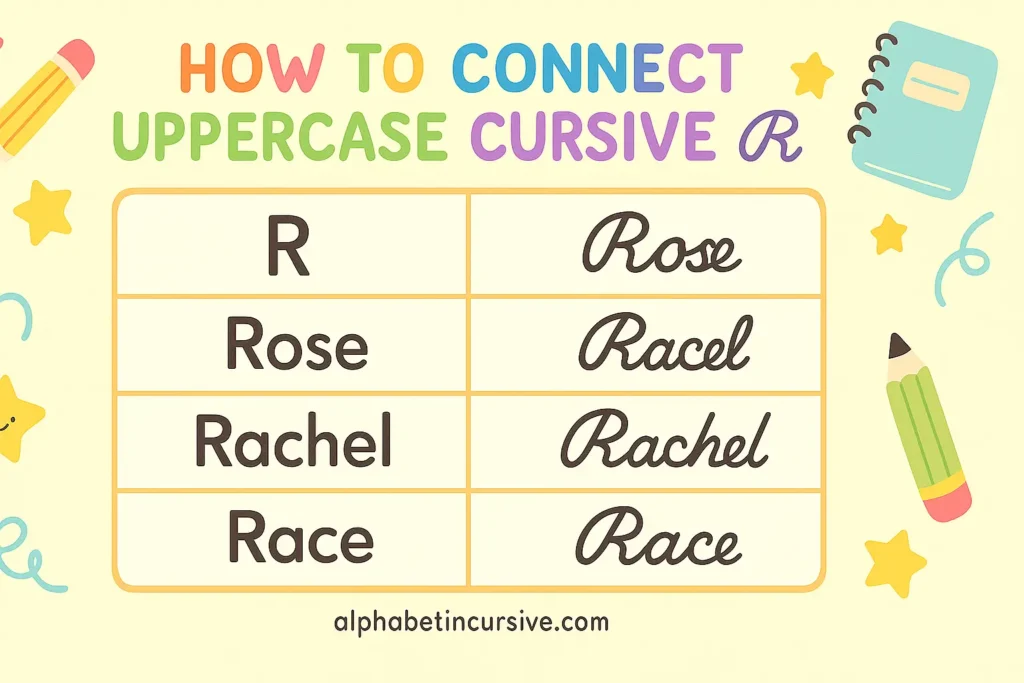
If connecting:
- After completing the leg of the R, add a small tail that curves up toward the midline
- The next letter should begin close to this point to keep spacing even
- Works best when followed by rounded letters like a or o
Practice examples: Ryan, Rose, Rachel
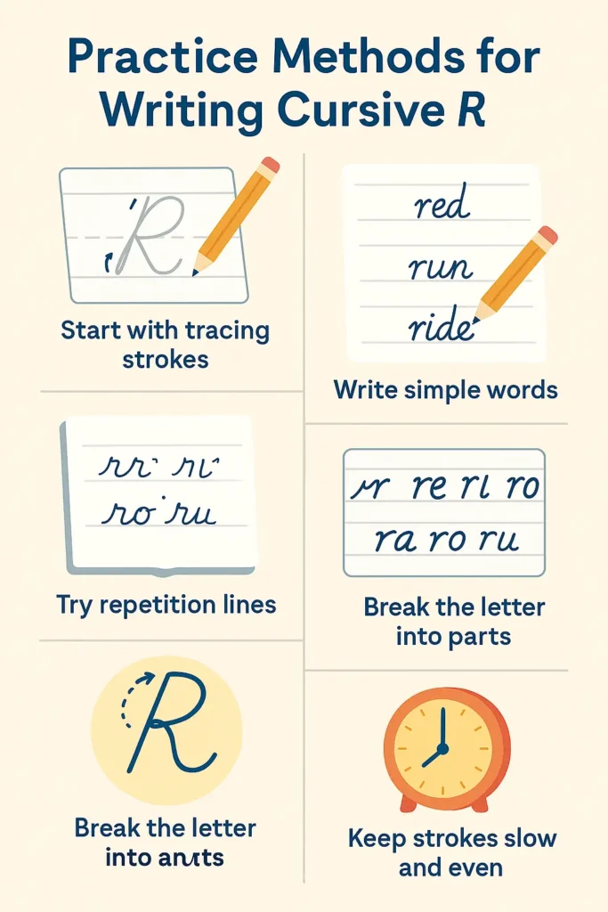
Practice Methods for Writing Cursive R
- Start with tracing strokes
Use a lined worksheet that shows arrows and stroke guides. This helps you understand the basic motion for both uppercase and lowercase R. - Move to dotted letter practice
Trace dotted versions of the letter repeatedly. Focus on pressure, shape, and size — especially keeping the loop on uppercase R balanced. - Write simple words
Practice common R words like red, run, ride and names like Rita, Ryan. This helps you learn how the letter connects. - Try repetition lines
Fill rows with rrrr, ReRe, or ra, re, ri, ro, ru. Repeating the same strokes helps with hand control.
Frequently Asked Questions
Why does lowercase cursive r look like a small bump?
That’s the correct shape. It’s meant to be quick and upright with a small curve. It doesn’t loop like other cursive letters, which makes it look more compact.
Should cursive r touch the next letter?
Yes. The ending stroke curves up slightly so it can easily connect to letters like a, e, or i without lifting your pencil.
Is uppercase cursive R supposed to look like a P?
It starts like a cursive P, but ends differently. After the top loop, a diagonal stroke crosses down from the middle, giving it its own look.
Can I use printed R instead of cursive in names?
For formal cursive, it’s better to use the proper cursive uppercase R. But in casual writing, many people use a printed R for clarity especially if the cursive one is hard to read.