Cursive Alphabet: Letter V Worksheet and Practice Methods
Cursive V has a sharp, slanted shape that makes it easy to spot and slightly different from most rounded cursive letters. It looks like a pointy checkmark and needs a steady hand to form it cleanly. The lowercase form is short and quick, while the uppercase V takes more space and starts at the top line.
You’ll get a free printable worksheet designed to help improve your letter shape and writing speed. Let’s start by downloading the worksheet.
Download Free Printable Cursive V Worksheet
This worksheet is designed to help you write the cursive V with accuracy and control. Print the sheet and follow the strokes slowly. Use a pencil with a sharp tip so you can control the pointy shape of V more easily. Practice daily to build clean curves and smooth joins.
How to Write the Cursive Letter V
Cursive V stands out with its pointed shape and quick, angular motion. Both lowercase and uppercase forms use straight strokes, but they still connect smoothly in words.
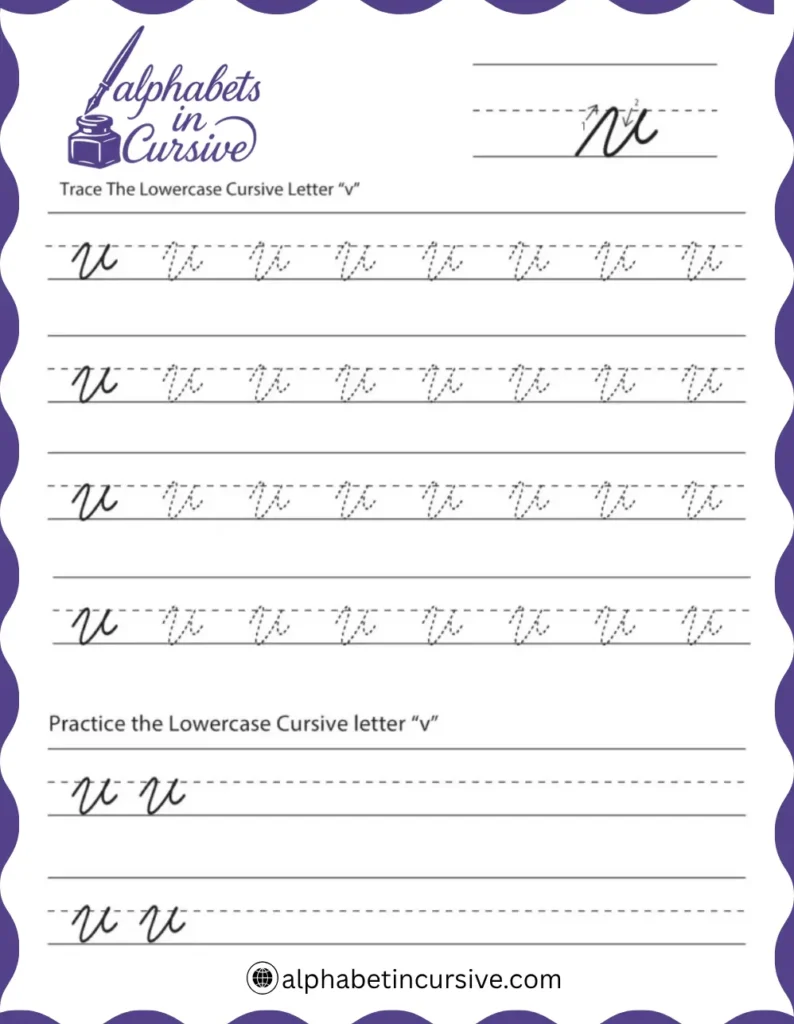
How to Write Lowercase Cursive V
The letter should look like a narrow “v” with an exit stroke — smooth but not rounded.
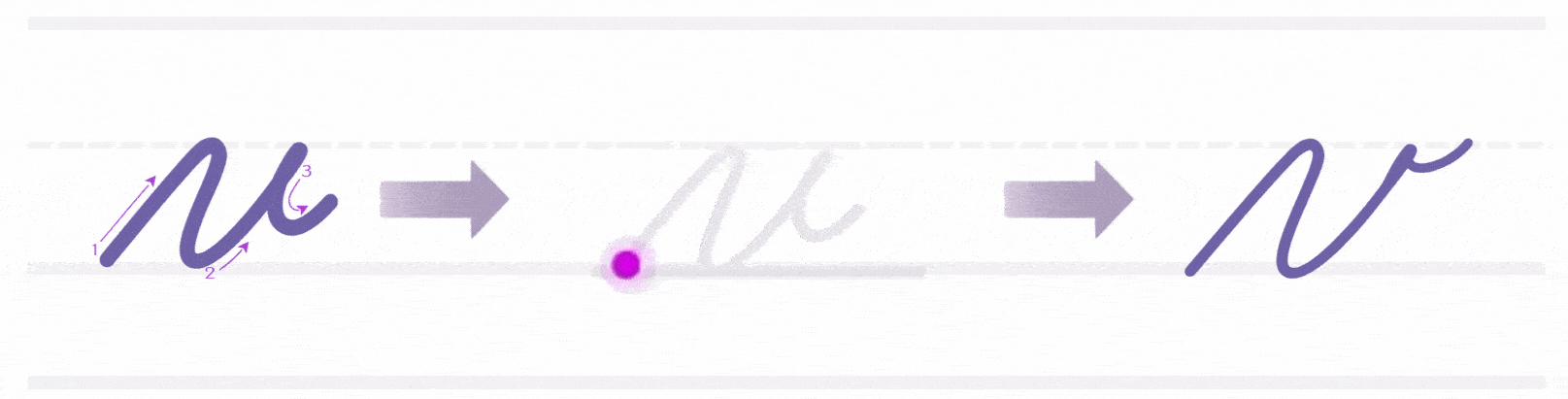
- Begin at the bottom line
- Pull a slanted upward stroke to the midline
- Without pausing, bring the stroke back down to the bottom line, forming a sharp point
- Then, create a second upward stroke that reaches the midline again
- End with a soft curve to the right for connecting to the next letter
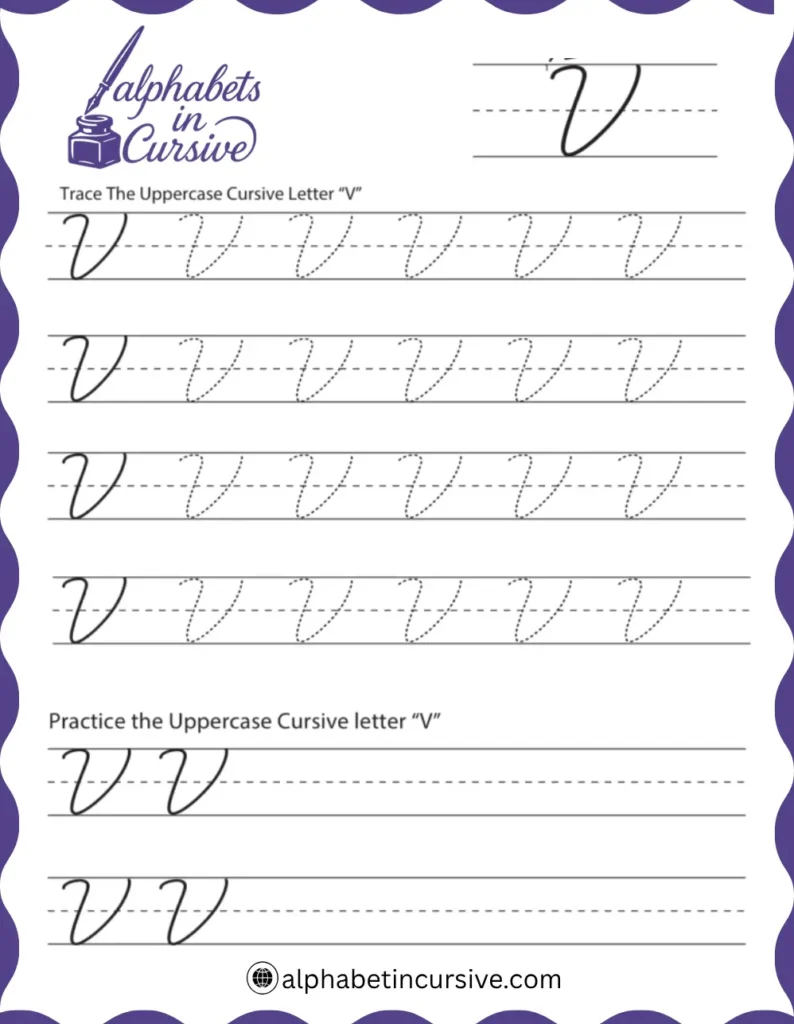
How to Write Uppercase Cursive V
Uppercase V often starts words. Keep it tall and spaced evenly, especially in names or titles.
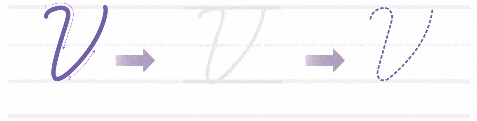
- Start at the top line
- Draw a downward slant that reaches the bottom line
- At the bottom, curve slightly left, then swing the stroke upward to the top right
- The full stroke should form a wide “V” that looks clean and open
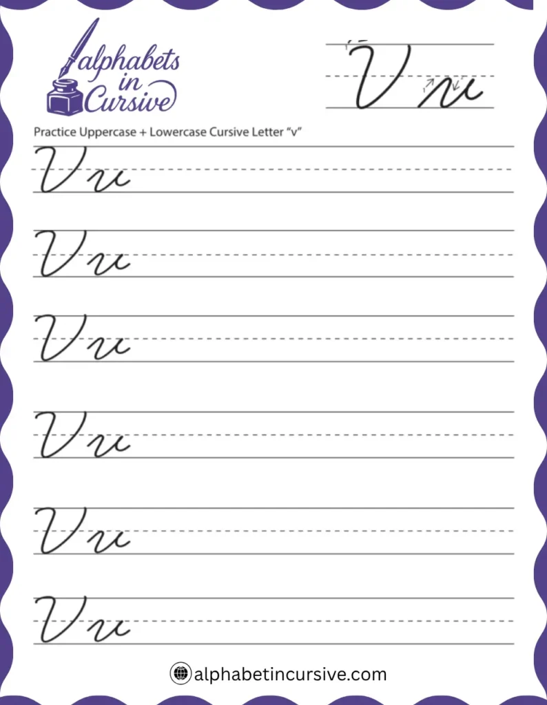
How to Connect Cursive V to Other Letters
Lowercase v connects easily with most letters. The key is keeping your exit stroke clean and not curving it too far. Uppercase V often stands alone, especially at the beginning of names, but it can connect if written carefully.
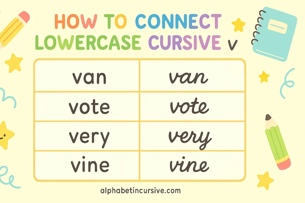
How to Connect Lowercase Cursive V
Practice short joins like va, ve, and vi to build speed and spacing.
- End the letter with a smooth exit stroke that curves slightly right
- This stroke should rise just above the baseline
- It connects best with letters like a, e, i, o, r, and u
Examples:
van, vote, very, vine, vivid
How to Connect Uppercase Cursive V
If connecting feels awkward or untidy, it’s fine to lift your pencil and start the next letter separately.
- After forming the full letter, you may add a soft exit curve on the right
- This can lead into the next letter when needed, though many styles don’t connect uppercase V
Examples:
Victor, Vanessa, Violet
Practice Methods for Writing Cursive V
Practicing the cursive V takes steady hand control and spacing awareness. These methods can help improve both.
- Start with guided tracing
Use the worksheet to trace lowercase and uppercase V. Follow the slanted strokes carefully. - Draw short letter pairs
Practice common joins like va, ve, vo, vi. These build fluency and improve your spacing between letters. - Write simple words
Try words like van, very, vote, vivid. Use lined paper to check alignment and size. - Practice capital names
Use names like Victor, Vanessa, Violet to build control with uppercase V and joining. - Slow down and repeat
Take your time. Repetition with clean strokes is more effective than rushing through pages.
Frequently Asked Questions
Why does my cursive V look too round?
That’s a common issue. Cursive V should have pointed angles, not curves. Keep your upstroke and downstroke straight and sharp.
Is cursive V the same as printed V?
Not exactly. The shape is similar, but cursive V has a smoother, slanted motion and ends with a connecting tail.
Why is uppercase V hard to connect?
Because of its sharp shape and tall height, it often doesn’t link well. In names or titles, it’s okay to leave it unconnected.